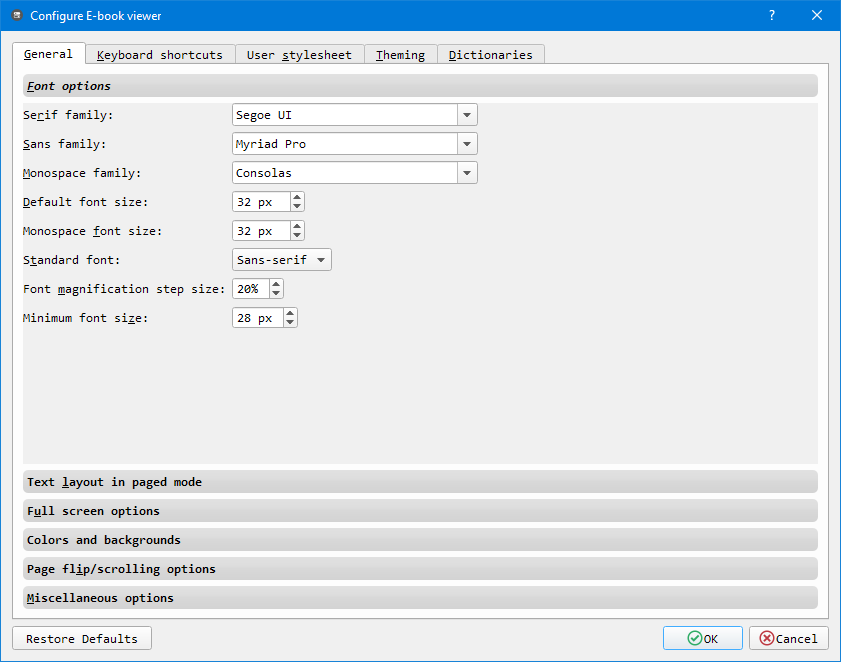
Optimal font-smoothing for Calibre ePUB Reader
Calibre is a pretty popular eBook reader but it has a weakness. Fonts looks terrible, at last on Windows. Here you’ll find an easy solution for this.
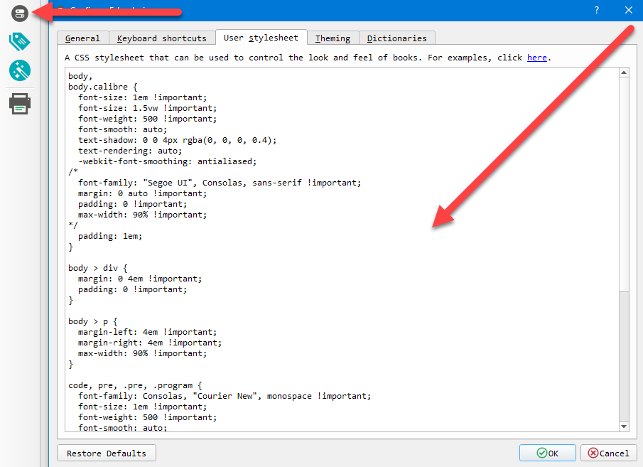
This is my CSS Stylesheet for a better “Font Smoothing” in Calibre and it works pretty well.
body,
body.calibre {
  font-size: 1em !important;
  font-size: 1.5vw !important;
  font-weight: 500 !important;
  font-smooth: auto;
  text-shadow: 0 0 4px rgba(0, 0, 0, 0.4);
  text-rendering: auto;
  -webkit-font-smoothing: antialiased;
/*
  font-family: "Segoe UI", Consolas, sans-serif !important;
  margin: 0 auto !important;
  padding: 0 !important;
  max-width: 90% !important;
*/
  padding: 1em;
}

body > div {
  margin: 0 4em !important;
  padding: 0 !important;
}

body > p {
  margin-left: 4em !important;
  margin-right: 4em !important;
  max-width: 90% !important;
}

code, pre, .pre, .program {
  font-family: Consolas, "Courier New", monospace !important;
  font-size: 1em !important;
  font-weight: 500 !important;
  font-smooth: auto;
}

p {
  margin-bottom: 1em !important;
  text-indent: 0 !important;
}

div.figure {
  margin: 2em 0 !important;
}

div.note {
  padding: 1em !important;
  margin: 2em 0 !important;
}

div.list {
  margin: 1em !important;
}
I recommend the following fonts, in case they exist on your machine.